Income and Wealth Inequality: The Facts
Income and wealth inequality has been getting mainstream attention, with books like Capital in the Twenty-First Century (Piketty, 2013) selling over 1.5 million copies. This post presents some basic facts about the distribution of income and wealth over the past 15 years.
Income Inequality
A common “fact” mentioned in discussions on income inequality is that the average CEO makes over 200 times as much as the median worker (see glassdoor for one such example).
While I don’t have data to test this directly, we can still get a general idea of how incomes are distributed. Below, I’ve tabulated several income percentiles for men aged 18-65 (the 50th percentile is the median):
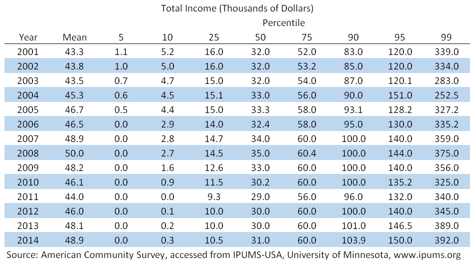
Over the past 15 years, the 5th, 10th, 25th and 50th percentiles have decreased, while the higher percentiles have increased. This is why the median has stayed about the same but the mean has increased. The ACS data actually understates this result, as the income of very wealthy people is replaced with the average income of people with similar characteristics, so you can’t identify individuals (i.e. Bill Gates, Tim Cook, etc.). See here for more details.
This also means we are not getting the top 1% of the top 1% (i.e. the CEO’s). We can see, however, that the top 1% are earning at least 10x as much as the median household.
Below, I show a frequency distribution of income (weighted by the “person weight” in the ACS data) for 2001 and 2014:
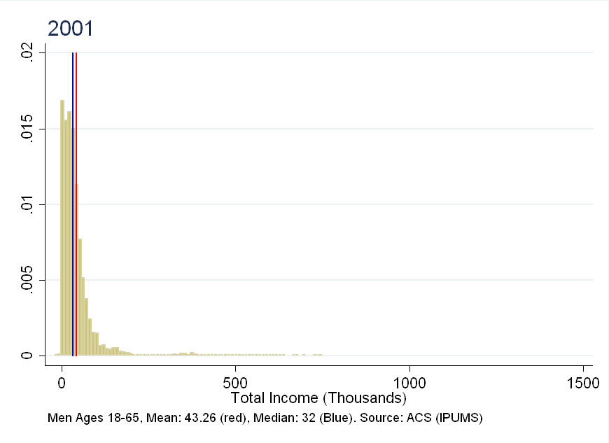
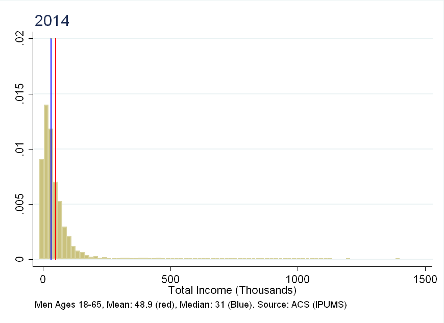
As you can see, the right tail has become “heavier”, with more individuals well above the median.
Wealth Inequality
People like Tim Cook don’t just earn a lot of money, they also accumulate substantial wealth. For this type of analysis, I can only get very aggregated data (source: census). The wealth distribution is broken into 5 groups (Q1 being the lowest, and Q5 being the highest). Below, I plot the evolution of median net worth by group:
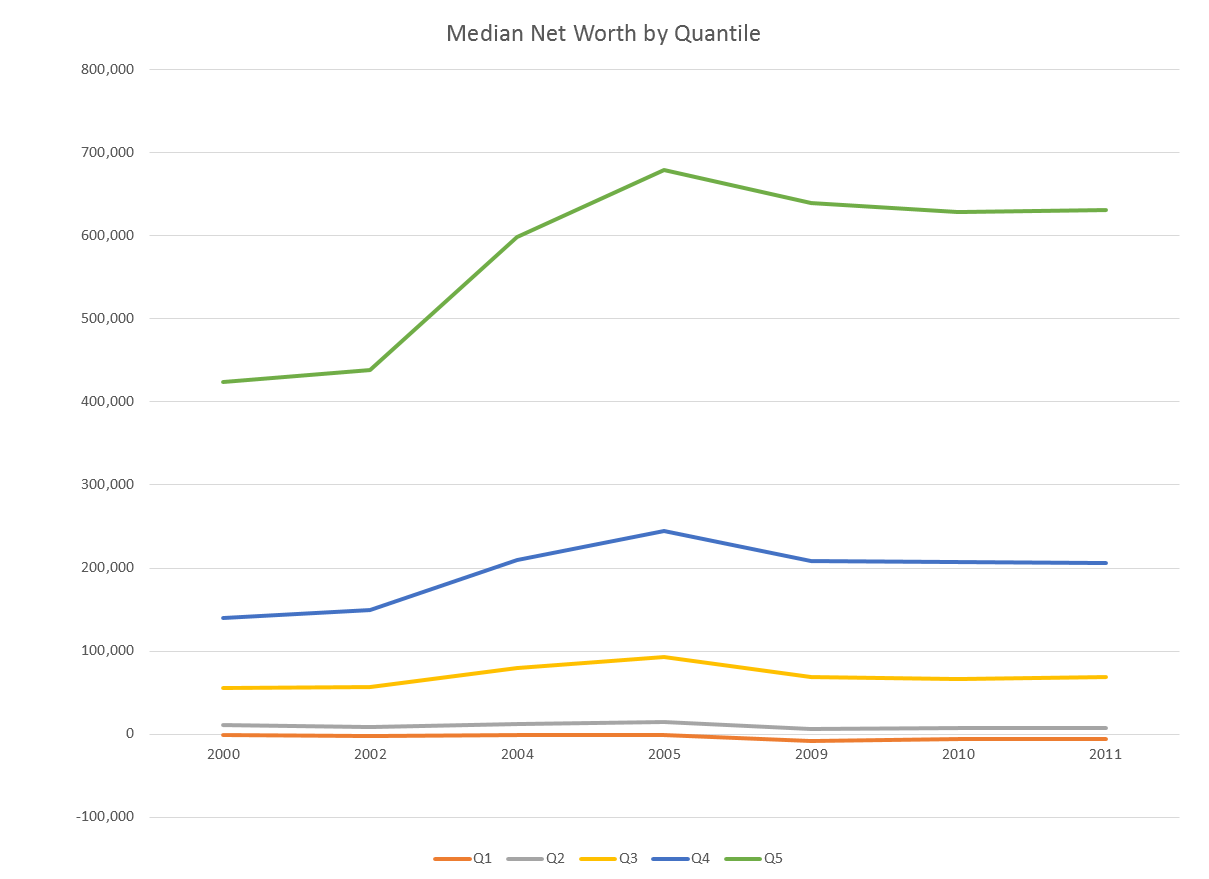
Similar to income, it has increased for the top groups, and stayed flat or decreased for the bottom groups.
The median of the top 20% (the 90th percentile) has been flat for the past few years, but the mean has continued to increase:
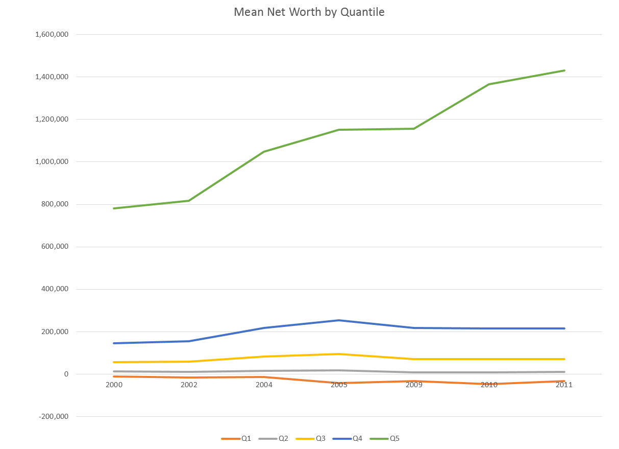
This implies that the net worth of those in the top of Q5 is increasing (if everyone in Q5 had increasing net worth, the median would be growing as well).
Rates of Return
One of the factors that may drive wealth inequality is that wealth can be invested, and turned into even more wealth. Below I present two charts showing the total return on housing, stocks and bonds, relative to GDP (source Federal Reserve Economic Data):
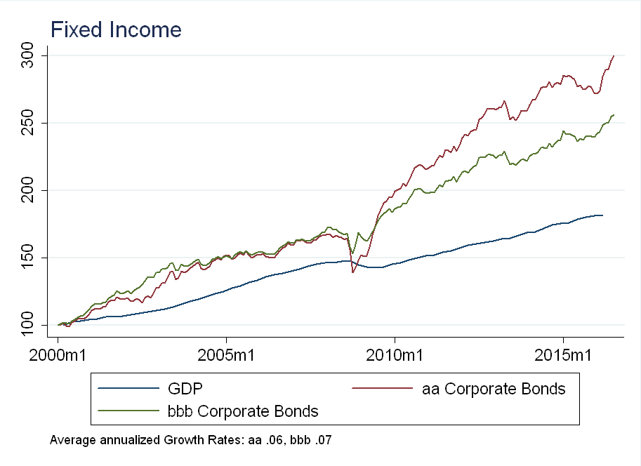
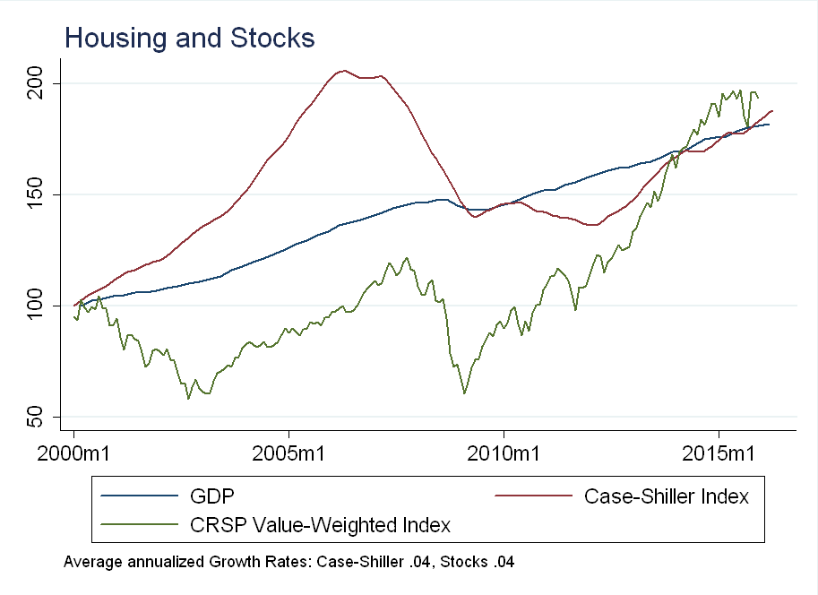
According to the census data above, mean net worth increased by an average of 5.65% per year for the top 20% of households and 3.59% per year for the next 20% of households. It’s interesting that this is close to the average growth rate for housing and stocks over the same period (although this is purely suggestive evidence).
Future Work
One of the problems with the evidence I’ve presented is that it is static. It’s true that top 20% are increasing their wealth/income relative to everyone else - but that group isn’t necessarily the same people every year.
According to a Fortune article, “70% of the population will have experienced at least one year within the top 20th percentile of income.” A next step would be to use the Panel Study of Income Dynamics (PSID), which unlike the census tracks the same individuals over time. The PSID can be used to compute the transition probabilities between income quantiles to understand the dynamic nature of inequality over time.