Cluster Analysis
Who are Amazon’s (AMZN) competitors? This seems like a simple question, but I don’t think there is an easy answer. In the finance literature, competitors are often identified using some definition of industries like SIC or NAICS, but I don’t think that will work for AMZN. What industry is Amazon in? Books? General merchandise (Amazon basics)? e-Commerce (Amazon Prime)? Entertainment (Prime Video and Prime Music)? Business Services (Amazon Web Services i.e. AWS)? Technology (Alexa, Kindle, Fire, …)? Or all of the above?
I went on S&P Capital IQ, and their system identified the following competitors for Amazon:
Alibaba (another e-commerce giant)
Walmart (another store that sells almost everything)
jd.com (another e-commerce giant)
Priceline (not sure that Amazon is in the hotel/airfare business yet…)
ebay (another e-commerce giant)
Netflix (Amazon streams movies and TV shows, and produces original content)
Apple (Amazon makes their own tech products: the Kindle, Fire, Alexa, etc.)
Google (another tech giant)
Facebook (not sure that Amazon is in the social media business yet…)
I found this list dissatisfying, so I wanted to try something different: I could let the stock market tell me which firms are connected to Amazon. Specifically, if a firm’s returns were sufficiently correlated with Amazon’s returns, after accounting for the effect of common components (e.g. market-wide risk), then those firms should somehow be connected to Amazon. This got me interested in Affinity Propagation, a clustering algorithm which I will describe in the next subsection.
Set Up
I am not an expert on cluster analysis, but here is my understanding based on reading the Wikipedia page, the Python package documentation and one of the associated examples.
Affinity Propagation is a clustering algorithm i.e. it is an algorithm for grouping data. The key trade off is minimizing the distance between each data point and the closest cluster center (called an ‘exemplar’) and minimizing the number of clusters. The two extremes of this are (1) Set the distance between all the points and the exemplars to zero by making each data point its own cluster (2) Only have one exemplar. Which of these forces will dominate depends on parameters you choose when running the algorithm.
For all the applications in this blog post, the affinity propagation model will have the following ingredients:
Input: Sparse covariance matrix of stock returns (computed using this python package). How the sparsity works: Suppose we are working with firm-level returns. Then, if two firms have independent returns conditioning on the returns of all other firms, the corresponding coefficient in the precision matrix (i.e. the inverse of this sparse covariance matrix) will be zero. I am using the sparse covariance matrix, rather than the standard covariance matrix, to take out common factors in stock returns.
Output: Exemplars i.e. the firms that are most representative of other firms, as well as the members of each cluster. Note that the model chooses the number of clusters by itself, but the number of clusters chosen depends on a parameter chosen by the user. This parameter determines which of the two trade-off forces outlined above (small distance between data and exemplars vs. small number of clusters) dominates. For all the applications in this blog post, I used the default parameters in the python package, and did not attempt to do any tuning.
One last point: How is this affinity propagation algorithm different than just forming groups of firms based on correlation? The answer is, not really. The firms within each cluster are more correlated with each other than with any group of firms outside the cluster (I checked this), but the algorithm does some extra work. It tells us the right number of clusters. Even though the number of clusters depends on an input parameter (so there is some equivalence between choosing the number of clusters, and choosing this parameter), we can fix the parameter and feed in data from different time periods, and see how the number of clusters the algorithm chooses changes over time. This will become more clear in my fourth application below.
Application One: Simulation
Before I started working with real data, I wanted to work with simulated data. This way I could get a better understanding for where the clustering algorithm succeeded, and where it struggled. I started by simulating the following model: \begin{equation} r_{i,t}=\beta_{i,1} r_{1,t} + \beta_{i,2} r_{2,t} + \beta_{i,3} r_{3,t} + e_{i,t} \end{equation} where \(r_{i,t}\) is the return on stock \(i\) in period \(t\), \(\beta_{i,j}\) is the loading of stock \(i\) on factor \(j\), \(r_{j,t}\) is the return of factor \(j\) at time \(t\), and \(e_{i,t}\) is a firm-specific error term at time \(t\).
I wanted to see if the AP algorithm could correctly cluster firms, so I started by creating 4 groups of firms with similar loadings on the common risks – which I call ‘risk groups’. Specifically, within each of these four risk groups, each \(\beta_{i,j}\) is equal to a constant plus some noise. For example: If the average firm in group 1 has a \(\beta_{i,1}\) i.e. a beta of one on the first factor, each of the individual firms have betas normally distributed around 1 with some positive variance. I add this noise to the betas because I found that simulating a model with constant factor loadings within each group can lead to a (close to) singular sparse covariance matrix.
I find that the affinity propagation (AP) model usually correctly groups firms in the same ‘risk group’ into the same cluster. How accurate this process is depends on (1) How far apart the average betas in each group from one another and (2) The variance of the noise i.e. \(var(e_{i,t})\). More dispersion in underlying factor loadings usually leads to fewer clusters, while more noise usually leads to more clusters.
To get some intuition, I draw plots which summarize the sparse covariance matrix and clustering algorithm. We can think of the distance between points on the plot as how useful one firm’s stock returns are for predicting contemporaneous variation in other firms’ stock returns (closer means more predictive power). This is not exactly right, as we are flattening a high-dimensional object, the covariance matrix, into a 2-dimensional picture. To add a more dimensions to the picture, the darker/thicker the lines, the stronger the covariance between the firms.
In one instance, where I made \(var(e_{i,t})\) relatively large, the algorithm still correctly identifies 4 clusters, but some firms (represented by dots) get grouped incorrectly.
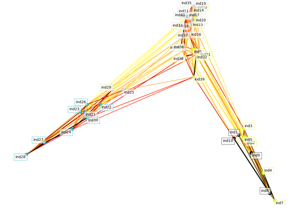
Note that in this plot, and all the other plots, the color of the dots/color of the boxes around the firm/industry name identify the clusters. In this plot, the 4 clusters are denoted by light blue (bottom left), light gray (left and middle), yellow (middle and bottom right) and black (bottom right).
When I reduce \(var(e_{i,t})\), the algorithm incorrectly identifies 5 clusters by splitting up one of the “correct” clusters:
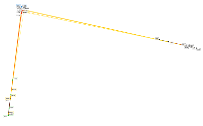
Here, the true bottom left cluster is split into two clusters: green and yellow.
To have the algorithm correctly identify all 4 risk groups I found I needed the following: (1) Reasonably large dispersion in factor loadings between clusters (2) Relatively small \(var(e_{i,t})\). This process convinced me that the AP algorithm is useful for grouping firms. When given a precise enough signal, it is able to identify a cluster structure in the underlying data. With this in mind, I was ready to take the algorithm to some real-world applications.
Application Two: Fama French Size/Value Factor Portfolios
The Fama-French 25 size and book-to-market portfolios have been studied extensively. It is well known that there is a strong factor structure in these portfolios, so I was curious what would happen if we put them into the AP model:
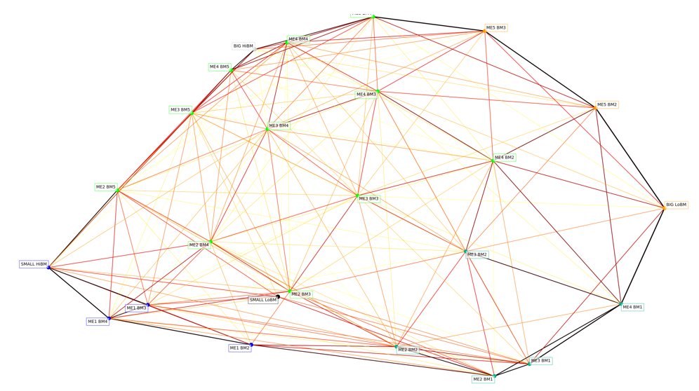
Here, I am using the monthly returns from these portfolios between 1926 and 2018. Using this data, the algorithm identified 6 clusters (ME is for equity/size, BM is for book-to-market/value):
Cluster 1: SMALL LoBM
Cluster 2: ME1 BM2, ME1 BM3, ME1 BM4, SMALL HiBM
Cluster 3: ME2 BM1, ME2 BM2, ME3 BM1, ME3 BM2, ME4 BM1
Cluster 4: ME2 BM3, ME2 BM4, ME2 BM5, ME3 BM3, ME3 BM4, ME3 BM5, ME4 BM2, ME4 BM3, ME4 BM4, ME4 BM5, ME5 BM4
Cluster 5: BIG LoBM, ME5 BM2, ME5 BM3
Cluster 6: BIG HiBM
Obviously, there is something special about the extreme portfolios: SMALL LoBM and BIG HiBM! Other than that, it is hard for me to take away anything from clusters 2 to 5.
This, however, got me thinking: how is AP different than factor analysis? I decided to do principal component analysis (PCA) on the same 25 portfolios. The figure below plots the loadings of the portfolios on the factors:
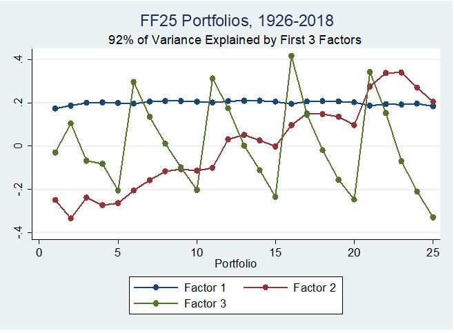
Note that portfolios 1-5 are made up of the smallest 20\% of firms by market capitalization, while portfolios 21-25 are made up of the 20% largest by market capitalization. Portfolios 1, 6, 11, 16, and 21 have the lowest book-to-market, while portfolios 5, 10, 15, 20 and 25 have the highest book-to-market.
The factor structure is clear here – factor one is pretty much constant, and is probably something like the market. As we increase size, we increase loading on factor two. As we increase book to market, we decrease the loading on factor three. This point has been made before for different groups of portfolios, see e.g. John Cochrane’s blog post.
It seems like when there is a strong factor structure, PCA may be more useful than cluster analysis. With this in mind, let’s take the AP algorithm to portfolios without a strong factor structure.
Application Three: Fama French Industry Portfolios
Now, let’s take the AP model to a set of portfolios that is not well known to have a factor structure: The Fama-French industry portfolios. Here is the visualization (based on daily returns, for the sample where all the industries have non-missing daily returns):
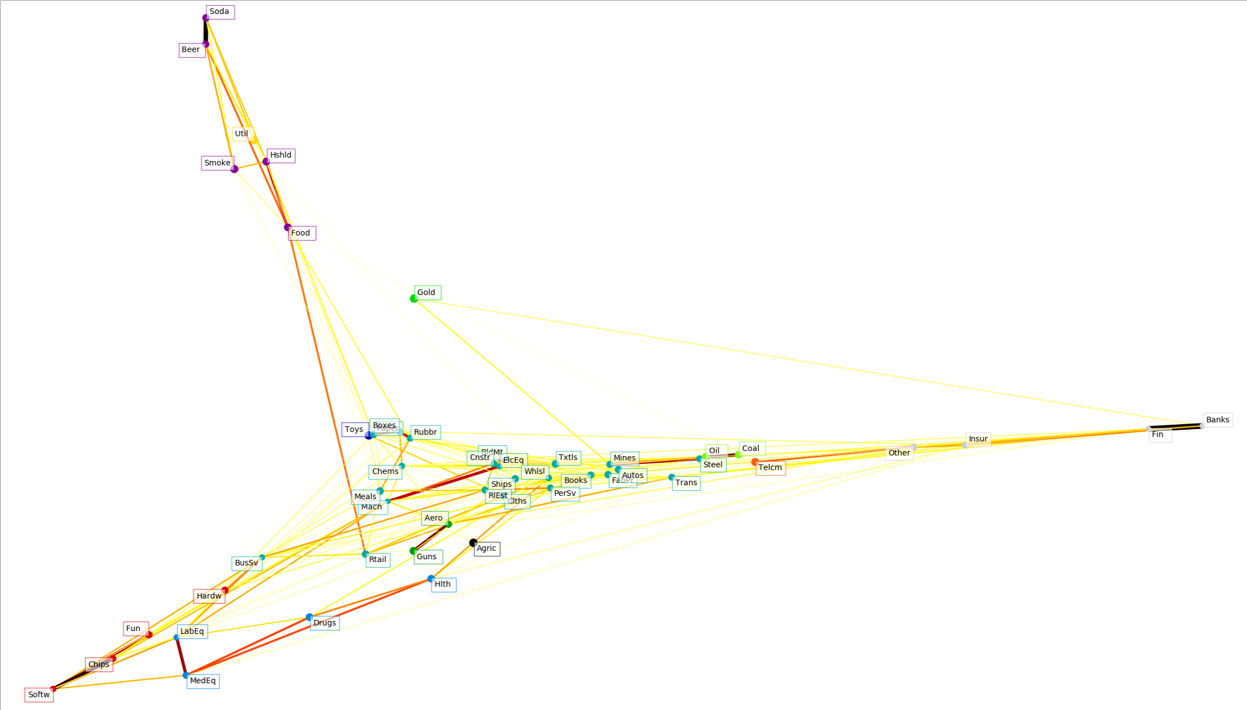
Here are the clusters the algorithm identifies
Cluster 1: Agric
Cluster 2: Food , Soda , Beer , Smoke, Hshld
Cluster 3: Toys
Cluster 4: Hlth , MedEq, Drugs, LabEq
Cluster 5: Books, Clths, Chems, Rubbr, Txtls, BldMt, Cnstr, Steel, FabPr, Mach , ElcEq, Autos, Ships, Mines, PerSv, BusSv, Paper, Boxes, Trans, Whlsl, Rtail, Meals, RlEst
Cluster 6: Aero , Guns
Cluster 7: Gold
Cluster 8: Coal , Oil
Cluster 9: Util
Cluster 10: Telcm
Cluster 11: Fun , Hardw, Softw, Chips
Cluster 12: Banks, Insur, Fin , Other
Industries in italics are the exemplars of each cluster. I don’t think we should put too much weight on which firms are chosen as exemplars, however, as this is not stable, and depends on the input parameters for the AP model.
Looking at these lists, some of clusters make intuitive sense. Cluster 8 looks like energy. Cluster 12 looks like finance. Cluster 2 looks like consumer non-durable goods. Some clusters make less sense, like cluster 5, which looks like a mixture of several industries. At this point, I was still not sure if the AP algorithm was useful for real-world data, but I wanted to go back to my original idea, and apply cluster analysis to individual firms’ returns.
Application Four: Individual Firms
Let’s apply the AP algorithm to the 100 largest firms traded on US exchanges. I was curious how the clusters would change over time so I ran the algorithm on daily stock return data for four separate years. 2000, 2008, 2012 and 2017:
Here is the plot for 2000:
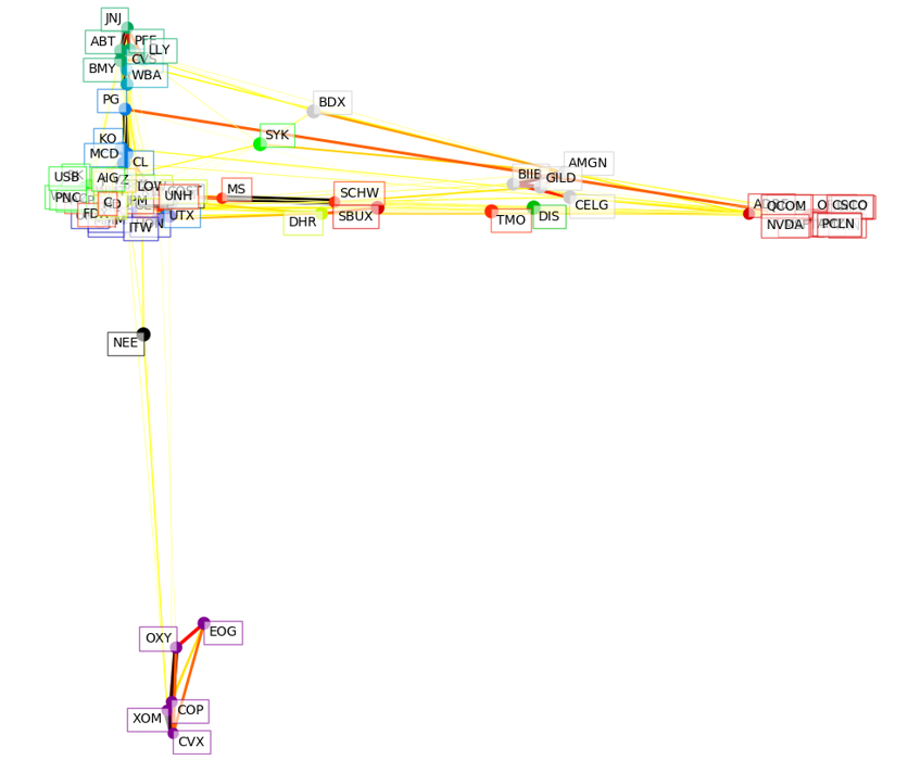
A few groups really stand out. The energy firms in the bottom cluster, the technology manufacturing firms on the far right, the biotech firms on the middle right, the pharmacy firms on the top, and the consumer products near the ‘middle’.
Here is the plot for 2008:
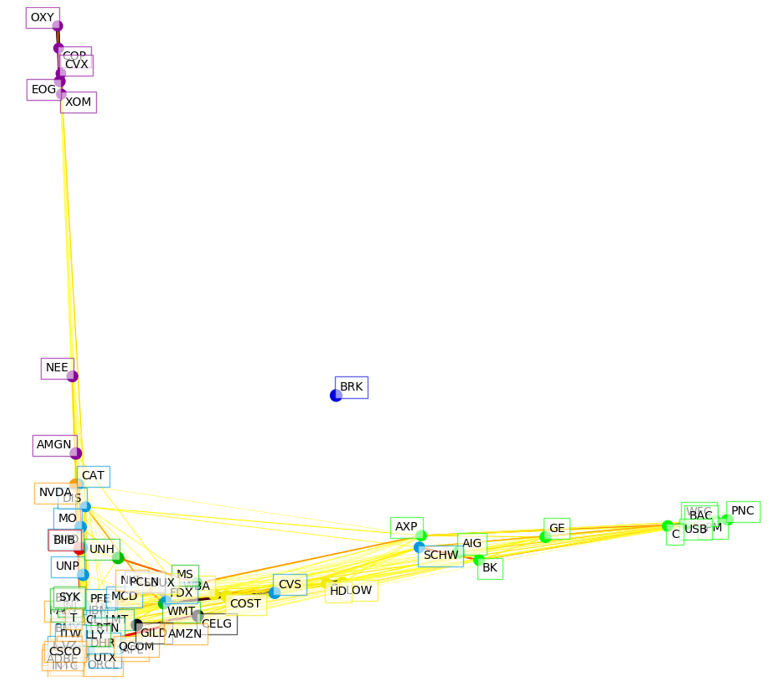
The big difference from 2000 is that (1) All the finance firms are now on their own in the far right (2) All the other firms except oil/gas have been compressed in a big ball (recall that during this time there was also a big shock to oil prices!). This compression is consistent with systematic risk dominating in a crisis. Also interesting is that Buffett, BRK, is all by himself in the middle of the plot.
Here’s the plot for 2012:
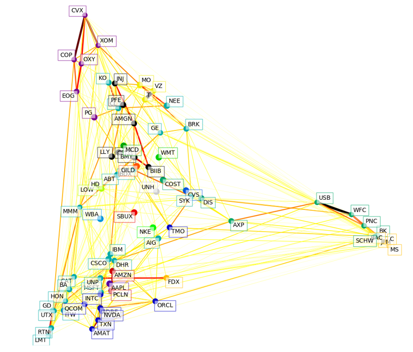
The big difference from 2008 is that things have spread out again. The financial firms are still in their own groups on the far right, but the rest of the firms have spread out as well.
Finally, here is the plot for 2017:
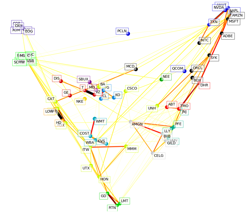
Now the tech giants have formed their own group in the top right. The financial firms are now all in the same cluster (light green, near the top left). This last exercise showed what I think is the most interesting application of cluster analysis: Keeping the parameters of the model constant, and feeding in data from different time periods.
Wrap Up
From all these exercises, I had the following takeaways: (1) Based on the simulation results, the AP algorithm is capable of correctly identifying clusters of firms exposed to similar risks (2) When we know the data has a strong factor structure, like the Fama-French 25 portfolios formed on size and book-to-market, cluster analysis seems less useful than PCA (3) When there is not a strong factor structure, cluster analysis usually identifies groups that make intuitive sense together (4) In my opinion, the most interesting application is how clusters evolve over time. We see that during the financial crisis, clusters coalesce, while during expansions, they spread out. I am definitely still not an expert on these clustering algorithms, but I learned a lot by working through this blog post!